 I suppose it’s not too surprising that browsing the shelves of new releases at my local comic shop has been particularly uninspiring lately. Most titles present themselves as overly-serious and self-important, and genres of crime and horror don’t really grab me. It’s been harder and harder to find monthly comics that are fun for me to read; even the usually-reliable Mark Waid’s current Shazam! series doesn’t really satisfy.
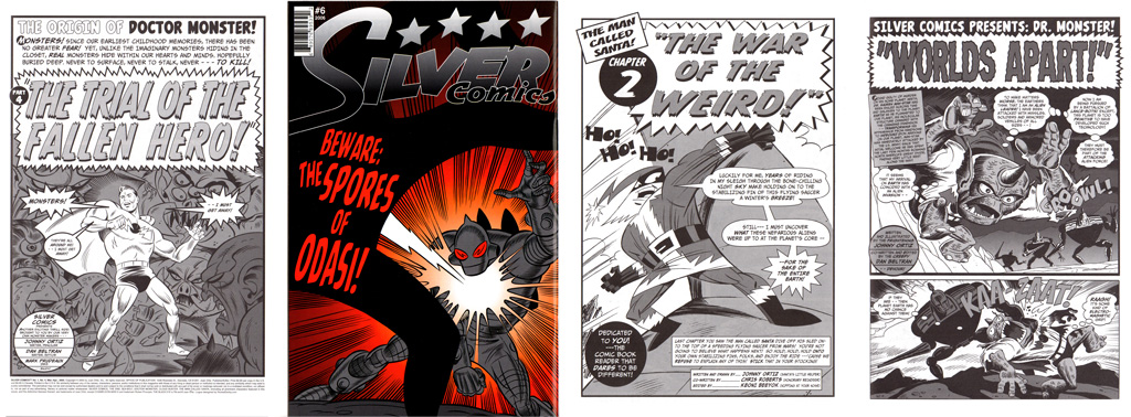
Fortunately, there is a vast backlog of comics I didn’t read when they were initially released that come closer to giving me what I’m looking for in a comic book … many of which are sitting on my own bookshelves, unread. Case in point is Juan “Johnny” Ortiz’ Silver Comics (8 issues plus an annual, 2004-2008): too often Silver Age pastiches come off as derivative of vintage stories, or flat out mocking the strengths those comics actually had. Silver Comics manages to capture the spirit and fun of earlier comics, but with characters and plots that breathe with a life of their own!
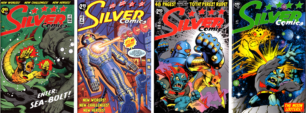 Silver Comics is a multi-character anthology, featuring Sea-Bolt (amputee diver with a fish-tailed supersuit), Cloud Buster (armored secret agent, trapped at the size of a giant), and (my personal favorite) Doctor Monster (monster-fighting superhero is set up by a corrupt government, and sentenced to life– as a monster!) among others. Each feature manages to capture the excitement and oddball ideas of the Silver Age, without being direct “homages” to characters of that period (the path chosen by the also entertaining 1963 and Big Bang series). The stories are largely written by Ortiz and Dan Beltran, with pencils and often finished art by Ortiz. Other finishing artists include Mark Prudeaux, Vince Musacchia, Alfredo Nunez, Scott Seeto, Bryon Mon, and others, who each bring their own flavor to Ortiz’ dynamic layouts.
Drafting well-known comic artists like Frank Brunner, Jim Starlin, and Nick Cardy (whose cover to issue #3 is particularly striking) to grace the covers (and help build pre-order numbers, no doubt) doesn’t really do the inside art justice. While both are good in their own way, the interior art sparkles with a lively quality, especially in Ortiz’ own “The Man Called Santa” feature, where Santa Claus and Rudolph battle Martians and even Satan himself!
Ortiz seems to keep a pretty low profile online, and I can’t find where he did much else in the world of comics. In addition to Silver Comics, Ortiz has had a career as an illustrator/designer for Disney and Warner Brothers. He’s also created a series of posters for the original (and Next Gen) “Star Trek” episodes, published in book form by Titan Books.
Full disclosure, I’m not sure that I actually found these at a 50-cent price point, but I didn’t get them when initially published, either. And if you’re able to find them at all– I suspect, like many indy comics of that period, they had a pretty small print run– they’re likely to be found in bargain boxes. If you ever do run across a copy of Silver Comics, give it a read; I don’t think you’ll be disappointed!
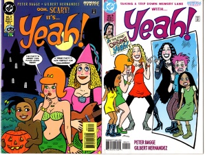 Yeah! #3-4 (DC, 1999-2000): I know I shouldn’t be surprised at how good these comics are (given that they’re by Peter Bagge & Gilbert Hernandez), but the rock ‘n’ roll sci-fi adventures of this girl group are worth a read if you ever come across an issue! I know I’ll be on the lookout for more!
 Avengers Annual #9 (Marvel, 1979): A pretty beat up copy, but it featured Don Newton art in one of his few Marvel assignments. I really love how busy the cover is, and the original Avengers logo seems really appropriate to me.
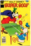 Super Goof #43 (Whitman, 1977): Not only did it have a fantastic cover cameo by Donald Duck, but it was also an issue I didn’t have!
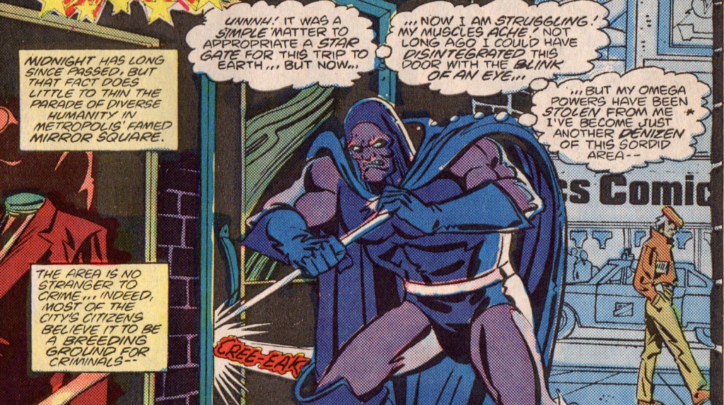 … the sight of Darkseid using a crowbar to break into a thrift shop was just too good to pass up! And that’s not even the most ignominius thing to happen to him in the first three pages, either! Almost puts
  I can’t recall when I first discovered the art of
  In addition to the mix of illustration styles, Kuper also gives each of his main characters a distinctive speech bubble and lettering style that mirrors their personality. This technique, which too often comes off as a distracting trick, works well here, likely due to the mix of drawing styles already at play in the book.
  When I moved to Memphis last year, I knew I’d be moving into a smaller space and that I had to pare my “stuff” down. A lot. That meant not only books, clothes, and CDs … but comics, too. Over the last few years, I had regularly been shedding comics I’d read (and may or may not have enjoyed reading) but didn’t want to keep in my collection. This time, though, was different. I also got rid of comics I’d liked. Comics I had actively collected. Comics I’d held on to for decades in some cases. Comics that were sometimes hard to let go of.

